1. Brand Essence
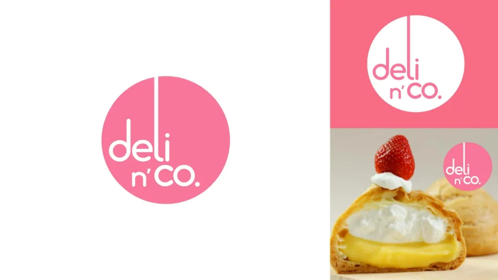
Deli n’co is a Japanese dessert brand built around the idea of joy, warmth, and sunshine. Our circular logo represents the sun — a symbol of cheerfulness and positivity. This simple yet memorable shape connects directly with our target audience: Gen-Z women who value fun, friendly, and stylish experiences.
The brand personality can be described in four words: cheerful, playful, approachable, and trendy.
2. Visual Identity
- Logo: Circular in form, designed to be instantly recognizable and emotionally engaging.
- Color Palette: Bright, warm tones inspired by sunlight and sweetness.
- Typography: Clean, modern, and approachable fonts that reflect friendliness and trendiness.
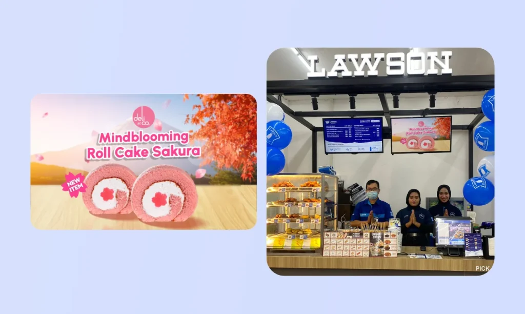
- Imagery Style: Light, colorful, and playful photography to highlight Japanese desserts in a joyful atmosphere.
3. Applications
Deli n’co’s brand identity must be applied consistently across all touchpoints:
- Instagram & Social Media: Fun, engaging posts with bright visuals and consistent brand voice.
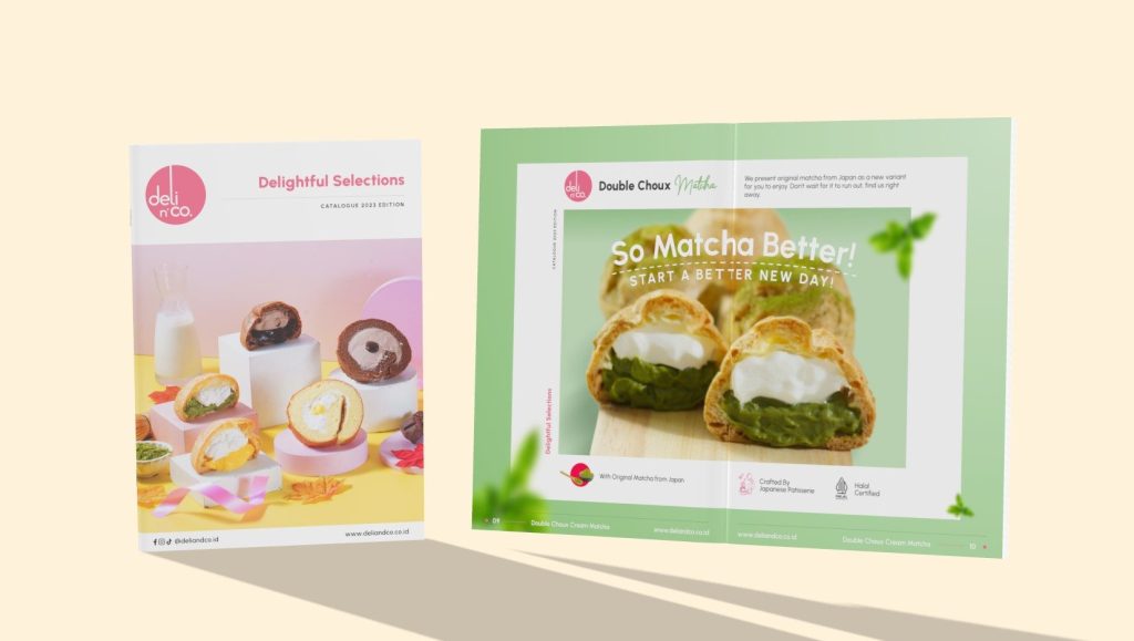
- Product Catalogs: Clear, minimal layout highlighting dessert photography with playful accents.
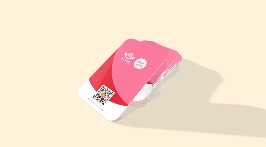
- Business Cards: Circular logo as the key element, paired with approachable typography.
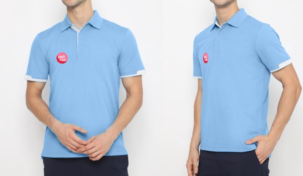
- Staff Uniforms: Casual yet coordinated outfits in warm tones, reflecting friendliness.
- In-store Display: Clean, modern, and joyful setups, emphasizing round shapes and warm color accents.
4. Design Tools & Workflow
All design work is developed primarily using:
- Affinity Designer → logo, vector assets, and layouts.
- Affinity Photo → photo editing, color treatment, and promotional visuals.
- Autodesk Maya (occasionally) → 3D elements for advanced visual concepts or in-store display previews.